

In this guide
The short version
The 2027 forecasts landed early this year. Most of them are worth reading. Most are worth doing here too, in an adapted form — and two we would leave on the page.
- The colour of the year is a moss-olive called Grounded, and it behaves very differently in tropical light than it does in a showroom.
- Texture is the year's big idea. Our humidity argues with the version being sold.
- The most useful 2027 trend for a Malaysian home is the one nobody is really calling a trend: doing less, and doing it slowly.
Every year around now the forecasts arrive, and every year they arrive written for somewhere else. Cooler light. Drier air. Older houses with thicker walls. Then they land in a KL condo with west-facing glazing and a wet kitchen, and about half of the advice quietly stops working.
So here is what the 2027 forecasts actually say, and what we would honestly do with each one in a home in Kuala Lumpur or Selangor. Some of it we like a great deal. Some of it we would leave on the page.
What the forecasters are actually saying
Four sources worth paying attention to have now published for 2027, and they agree more than they disagree.
Behr named its colour of the year in late August: Grounded, sitting between moss and olive with brown underneath it, at the head of a palette of warm neutrals, layered greens, muted pinks, clay and soft blue. TrendBible published three themes for life at home — texture drenching, a slow and low and no-renovation mood, and what they call embedded flexibility. Nordic Nest's Scandinavian read points at clay and mineral tones, sculptural tables, brushed metal instead of polished chrome, hand-finished ceramics, raw stone and timber, and a return of sixties and seventies geometry. And WGSN, with its colour arm Coloro, called Luminous Blue for 2027 as far back as April 2025 — a lapis sort of blue, chosen for fashion first, which is worth remembering before anyone paints a wall in it.
Put together, the year has a fairly clear mood: warmer, earthier, more textured, less flat. Which, if you have read what we think about style that lasts, will sound familiar. It is not a new idea. It is the same correction that has been running for a while now, arriving with a colour code attached.
Grounded, and what happens to it at three in the afternoon
The interesting thing about Grounded is that it is not one colour. Behr describes it shifting through the day — mossy and fresh in the morning, more openly olive by the middle of the day, browner and deeper by evening. That is a lovely property in a temperate room with soft north light.
Here, the afternoon is not soft. A west-facing unit at three o'clock gets a warm, strong, slightly golden light through a lot of glass, and it pushes an olive-brown much further towards brown than the paint card suggests. In a dim internal room with no daylight at all, the same colour can go flat and slightly grey.
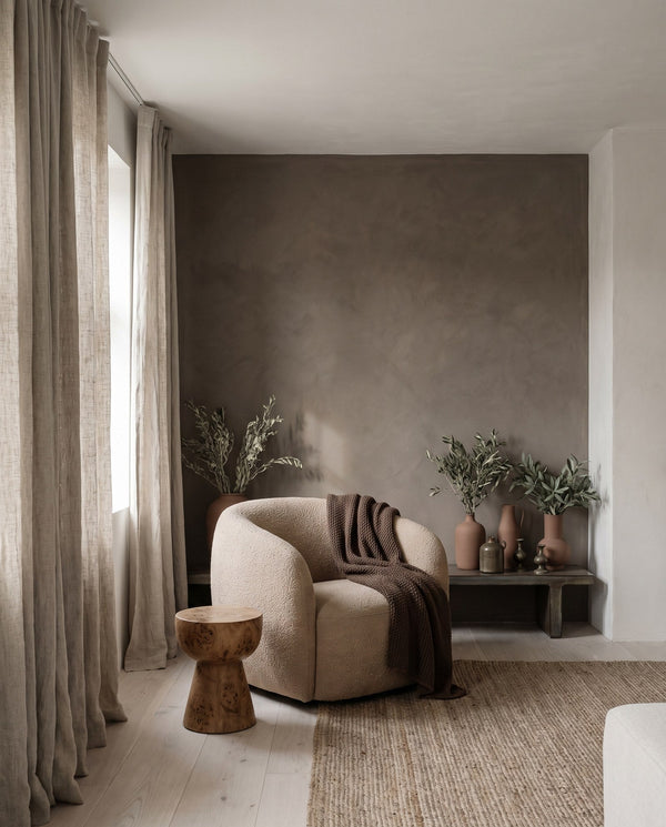
None of that makes it a bad colour. We would happily use it. We would just use it where you can see it change: on tall joinery, on a single wall that catches real daylight, on the inside of a shelf. Not wrapped around a whole room you have only ever seen at night.
Do the boring test. Buy the sample pot, paint an A3 piece of card rather than the wall itself, and move it around the room for two days. Look at it at 8am, at 3pm and with the lights on. Colour of the year or not, a colour that only works at one hour of the day is a colour you will get tired of.
Texture drenching, in a country at eighty per cent humidity
Texture drenching is the year's headline idea, and the thinking behind it is genuinely good: layer soft, tactile material across a room until it feels enclosed and quiet. Fabric absorbs sound. A room with soft things in it is measurably calmer to sit in than a room of hard flat surfaces, which is most new handover units, wall to wall.

The version being illustrated, though, is drapery running across walls as well as windows. In a home here we would not do that, and it is not an aesthetic objection. It is that heavy fabric held against a wall, in a climate this humid, in a flat where the air conditioning cycles on and off and cross-ventilation is often one corridor wide, is a slow invitation to damp and to smell. You will notice it about eight months in, and it is a miserable thing to undo.
The idea survives without the walls. Curtains that actually stack, a heavier weave on the sofa, a wool rug, an upholstered headboard, a fabric pelmet, timber with grain you can see. That is the same warmth and the same acoustic softening, in materials you can take down and wash.
The no-renovation year

This is the one we would push hardest, and it is barely a trend at all. The forecast calls it slow, low and no-reno: showing the honest, unglamorous, half-done middle of a home rather than the photographed end of it, and treating an unfinished room as somewhere you are allowed to live.
It maps almost exactly onto the advice we give people who have just collected keys. You do not know how you use a home until you have lived in it through a few months and a rainy season. Which corner gets used and which never does, where the light is unbearable at four, whether anyone ever eats at the dining table. Spend on the things you are certain about, live in it, and let the rest wait.
It is also, more or less, what our home styling work is: rooms rebuilt around the furniture you already own, rearranged and layered, with new pieces added only where something is genuinely missing. Working with what you have is not the compromise version. It is usually the faster route to a home that feels finished.
The honest caveat: no-reno is easier to romanticise in a country with old housing stock. A Malaysian handover unit usually does need the wet kitchen resolved and the wardrobes built, because the developer's version of both is rarely enough. So the trend is right in spirit and needs a local edit — do the things that are genuinely structural, then stop, rather than carrying on because the site team is already there.
One room, several jobs
Embedded flexibility — furniture and layouts that fold, stack, move and change use — is the trend that condos here have quietly wanted for a decade. When the living room is also the office, the gym on a Tuesday and the place four people eat, a room that can only do one thing is a room that is wrong most of the week.
Nothing about this is new to anyone who has designed a small unit. What is new is that the furniture is finally being made properly, rather than being the flimsy fold-away thing you regret. It is worth the wait and worth the money, because it is the trend that buys you floor area you have already paid for.

Finding those pieces is the slow, unglamorous part. It is most of what our procurement concierge does — sourcing across suppliers, comparing lead times and availability so one back-ordered sofa does not hold up the rest of the room.
The verdict, trend by trend
Design begins with listening, so the verdicts below are really one question asked nine times: does this serve the way you actually live? How a family starts its mornings. Where everyone ends up at the end of the day. How friends gather around the table. The things you reach for without thinking, and the objects that carry a story.
What we are after is a home that is beautiful without being precious, practical without losing its personality, and elevated without feeling overly designed. A trend that helps with that earns its place. One that does not is decoration with a date on it.
| The trend | What we think | What we would do |
|---|---|---|
| Grounded, the moss-olive | A colour that shifts through the day suits a room you live in from breakfast to bedtime — it is doing one thing when the family wakes up and another when everyone lands back on the sofa at night. That same restlessness is what makes it risky in our afternoon light. | Adapt. On tall joinery, or one wall the daylight actually crosses. Live with a painted card for two days before you commit. |
| Texture drenching | The instinct is right, and it is the most sanctuary-minded idea on the list. Soft rooms are quieter rooms, and quiet is most of what makes a home somewhere to land. It is the execution that is wrong for this climate. | Adapt. Curtains that stack properly, a wool rug, a heavier weave on the sofa, an upholstered headboard. Nothing fixed to a wall. |
| Slow, low, no-reno | The closest thing here to how we actually work. You cannot know where everyone ends up in the evening until you have lived a few months of evenings. | Adopt. Do the structural things once — wet kitchen, wardrobes — then stop, live in it, and come back to the rest when you know. |
| Embedded flexibility | The most useful idea on this list for a condo. When the same room is the office at ten and the place four people eat at eight, furniture that does one job is wrong most of the week. | Adopt. Spend properly on the few pieces that genuinely change use. Flimsy fold-away is worse than none at all. |
| Brushed metal over polished chrome | A detail nobody will ever compliment, which is exactly the sort that makes a home feel easy. Polished chrome shows every water mark, and here that is every day. | Adopt. Brushed on taps, handles and lamp bases, without thinking about it twice. |
| Raw finishes, carved stone, Corten steel | Lovely in a photograph. A maintenance job in a humid home — and maintenance is the opposite of restful. | Skip indoors. Take the idea instead as honest timber with grain you can see. |
| Curated nostalgia, deep wood, sixties geometry | The one that comes closest to the objects that carry a story. Old pieces are what stop a home looking delivered. A whole room of them reads as a set rather than a life. | Adapt. One or two pieces with some history, mixed into what you already own. |
| High-gloss lacquer | Beautiful light, constant upkeep. A surface you are forever wiping is a surface that quietly nags at you. | Adapt. Small doses, above hand height. Not on the doors a child opens forty times a day. |
| Luminous Blue | Chosen for clothes, and it shows. A strong blue room asks something of you every single morning. | Skip as a room. Very good as a cushion or a vase, where changing your mind costs nothing. |
Sources: Behr 2027 Color of the Year, reported 26 August 2026 · TrendBible, “Three interior design trends shaping life at home in 2027”, 17 August 2026 · Nordic Nest, “Scandinavian interior design trends 2027”, 25 May 2026 · WGSN and Coloro Colour of the Year 2027, announced April 2025.
Where it is cheap to change your mind
Here is the rule we use, and it is the only part of this article that will still be true in 2028. Play with a trend where reversing it costs an afternoon. Ignore it where reversing it costs a contractor.
- Paint. A wall is a weekend and a few hundred ringgit. If Grounded turns out to be wrong for your light, you have lost very little.
- Textiles. Cushions, throws, curtains, a rug. This is where a colour of the year belongs, and where it can leave quietly.
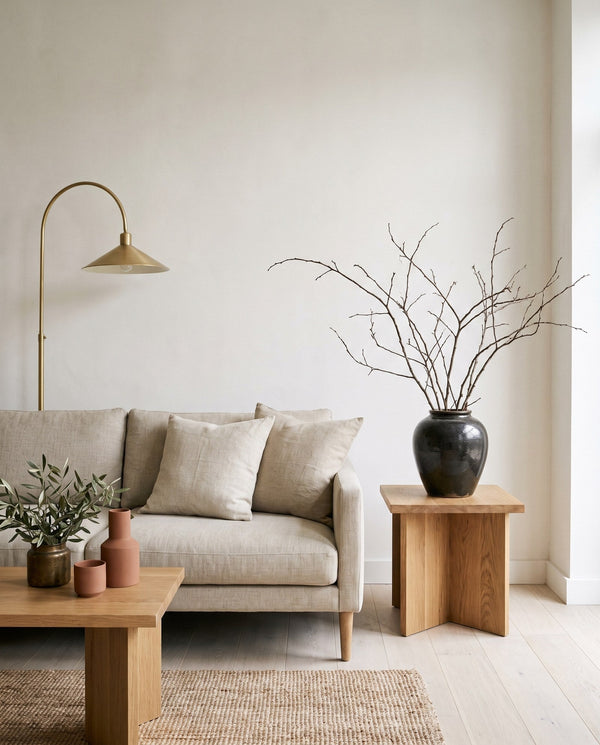
- One object. A sculptural side table, a brushed-metal lamp, a hand-finished vase. One good piece carries a trend better than nine cheap ones.
And the other side of it, the places we would not let a forecast anywhere near: kitchen joinery, wardrobe fronts, floor tile, stone, and the shape of the sofa. Those are the expensive, disruptive, hard-to-undo decisions, and they should be made on how you live and how the room is proportioned — never on what a palette is doing this year. If you are weighing up what those actually cost to get right, we have written about what interior design really costs in KL and Selangor separately.
What we would actually do
Every home we work on starts with listening rather than a moodboard — how you live, how you want to feel, what matters to you, and the small things that make a place feel like yours. No forecast can tell us any of that, which is why none of them ever start the conversation.
Still, if you handed us the 2027 forecasts and a home in KL, we would take three things from them and leave the rest. We would go warmer and earthier, because that suits our light and it is genuinely where things are heading. We would add texture in fabric and timber rather than in wall coverings, because of the climate. And we would do less, later, in the order you discover you need it.
The rest — the blue, the rust, the gloss, the seventies geometry — is fun to look at and cheap to try in small pieces. It is not a reason to open up a wall.
None of this changes the underlying advice, which is that the choices you will still like in ten years are almost never the ones with a year attached to them. Trends are useful as a weather report. They are a poor set of instructions. If you want to work through a room properly rather than by forecast, that is a different piece entirely.
Where to see this in practice
If you would rather see what we actually did than what we would do, here is where our own work sits:
- Our Portfolio — finished homes, which is the only honest version of “what we would actually do”
- Interior Styling — the “no-renovation year” route, and where it is cheap to change your mind
- Our Services — the four ways we work, if a trend above needs more than a change of furniture
Notes & further reading
This piece reflects ongoing work across Kuala Lumpur and Selangor.
About Angelica Lee
Chief Home Maker and founder of Sundays in Bed, award-winning interior designer. Learn more about Angelica →
Pictures, not jargon. A few questions about your home, and a personalised estimate in your inbox at the end.
Take the style quiz